Finally, a nice electronic medical record user interface! (or at least what I thought one may look like, back in April 2016).
Where did this come from?
The Concept Electronic Health Record (C.E.H.R.), was a project from a research block in second year General Internal Medicine residency.
The project was presented April 2016 at the University of Manitoba Resident Research Day. It won the Residents' Choice Award for Best Podium Presentation. At that time, the presentation was a slick 10 minute pitch.
I have entirely forgotten the script from that presentation. Therefore, a new commentary was written for this post, and goes into five times more detail than originally presented.
The core material - the slides - remain unaltered from April 2016. It is always a bit embarrassing to look back on old work. Many things seem outdated. Many design elements poorly constructed and limited by bad UX skills and the constraints of deadlines and time pressure.
Nonetheless, the general principles in this presentation remain untarnished by time, and I believe remain valuable considerations in EHR design.
beware: the slides have a horrifying number of spelling errors. Unfortunately it is very difficult to fix these errors given the way the slides are built in Keynote from components designed originally in Sketch. (This is what happens when you never learn to spell, and rely on the red squiggly line in MS Word for all your work starting in Grade 3).
New work?
My most recent try at EHR user interface design is summarized in an October 1, 2018 YouTube presentation - An EHR Design from First Principles. The slides from that presentation are available here.
As always, please send any feedback - or if you would just like to talk about EHR design - to gschmidt@medmb.ca or Twitter: @_GregSchmidt
A Superior Electronic Health Record Using Concept Design
The current state of electronic healthcare record user interface design among legacy vendors is very disappointing.
This project aims to demonstrate that it is possible to build a much better electronic health record (EHR) interface than the current status quo.
Unfortunately the ability to make progress in EHR user interface design in limited by the cost to develop and implement new systems.

For this reason, this project aims to propose a superior electronic health record, using concept design.
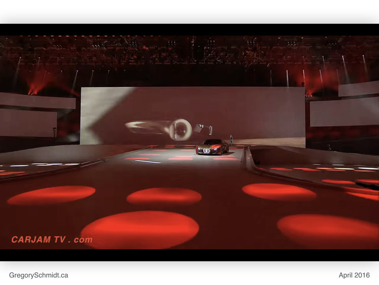
Concept design is a technique that frees one from financial and bureaucratic limitations. It allows one to imagine a future of ‘how something should be’, without the baggage of the past.
This encourages new thinking, and the ability advance a field. Concept design has helped push innovation in architecture and automobiles. We can apply this same technique to electronic health records.
I would like to thank my supervisors on this project, Dr Hajidiacos & Dr Battad. They took a gamble to sign off on permitting a resident to spend a month ‘designing EHR mockups’ as a ‘research project’.
The fundamental purpose of this project was to demonstrate how a better user interface for electronic health records is possible. I constrained this project to replacing existing medical record functionality. The project did not try to imagine how the medical record will operate in the future, such as with advances in voice recognition, augmented reality, or machine aided diagnosis.
The Design Process
To start, thousands of user interfaces were reviewed. Specific focus was given to reviewing complex software designed across all fields.
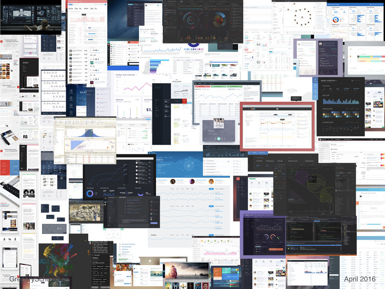
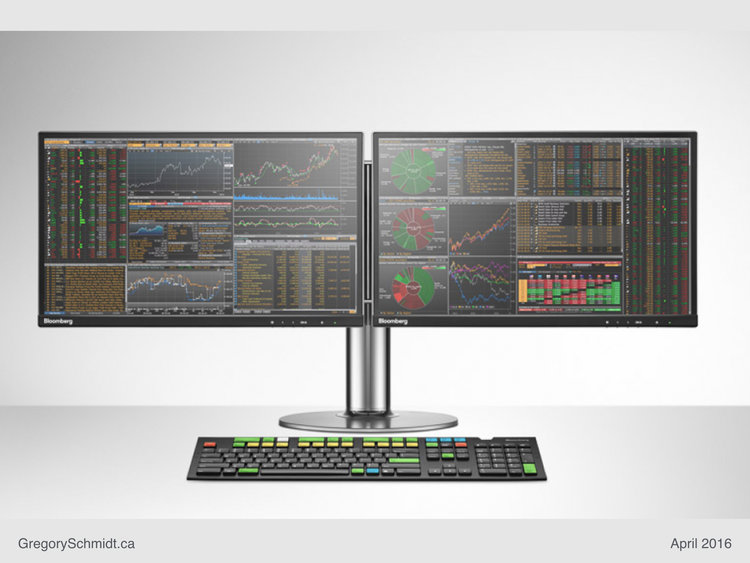
My absolute favourite interface, from the perspective of data visualization, remains the Blumberg Trading Terminal. Used for trading stocks, the Blumberg Terminal excels at data density and speed of use.
[Yes, I realize the learning curve for the interface is very steep and impractical to use in most of healthcare because the system almost entirely relies on keyboard shortcuts. However, once someone masters this, the system is blazingly fast to use. From a speed perspective, the mouse the the enemy.]
Look below at all the pretty data.
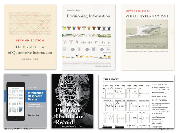
The foundational texts on the visual display of quantitative information come Edward Tufte. He has also written several articles specifically on visualizing medical data, such as the 1994 Lancet publication. I also reviewed over 20 other books on dashboard design and visual data display. Ultimately, almost every book is just a derivative of Tufte’s work (and lack Tufte’s engaging writing style).
Dr. J. Martin Wehlou has written an exceptional book on Rethinking the Electronic Healthcare Record. I recall reading it while concurrently while working on these problems and developing similar solutions to those he proposes. It is hard to explain exactly where his ideas versus mine start, converge, and overlap.
After a period of user interface design research, it was time to start working on identifying, grouping, and simplifying the many components required in an electronic medical record.
I had good success in the past using ‘How Can We…’ question prompts when brainstorming, and used IDEO’s much popularized Human Centred Design process in brainstorming and observing users operate EHR systems.
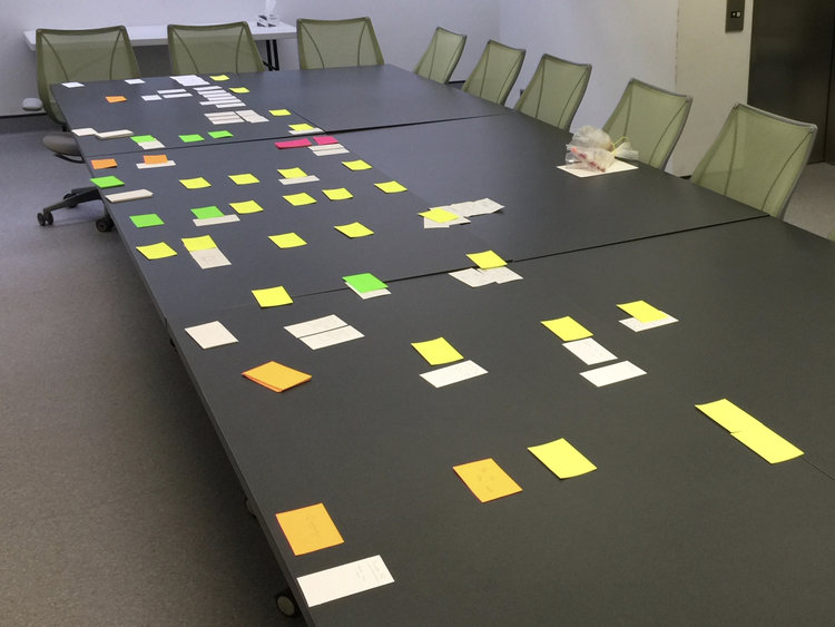
Now the hard part. Drafting mockups with pen and paper. The process is one of continuous simplification. Each new iteration tries to remove removal and merge functions and buttons until the most streamlined interface is possible. The best interfaces requires the fewest number of parts to achieve the highest level of versatility while being intuitive to a user who has never seen the screen before.
I find this process is always best accomplished with pen and paper, as opposed to the computer.
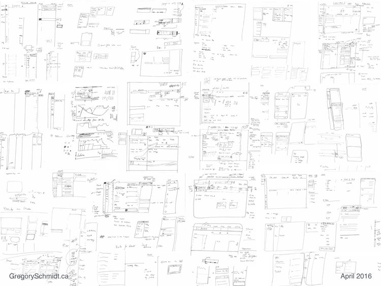
Once a general design approach was decided, it was time to draft mockups on the computer.
Mockups - First Introduction
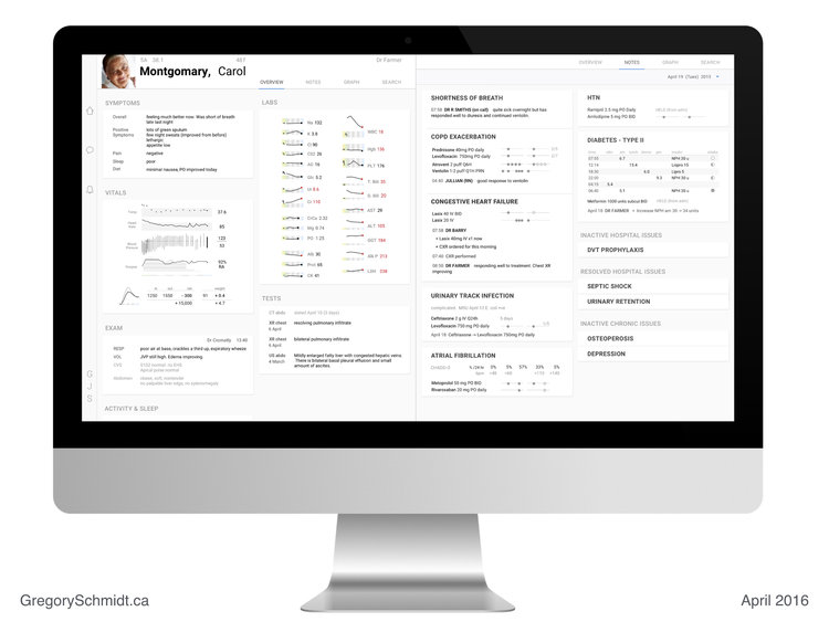
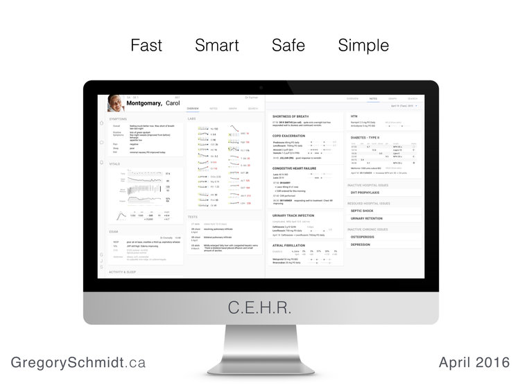
I would like to introduce you to C.E.H.R. - The Concept Electronic Healthcare Record.
C.E.H.R. is designed to be fast, smart, safe, and simple. Four attributes that one would be hard-pressed to use when describing current electronic healthcare systems.

Mult-Tasking Workspaces
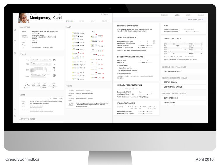
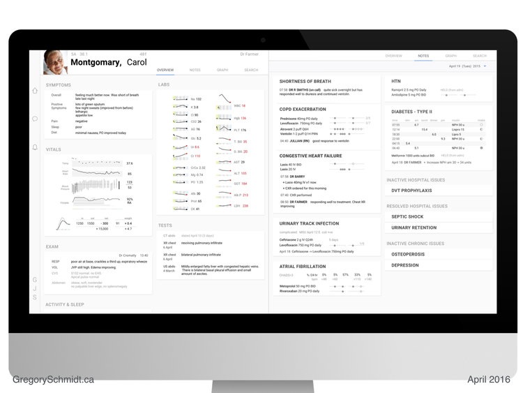
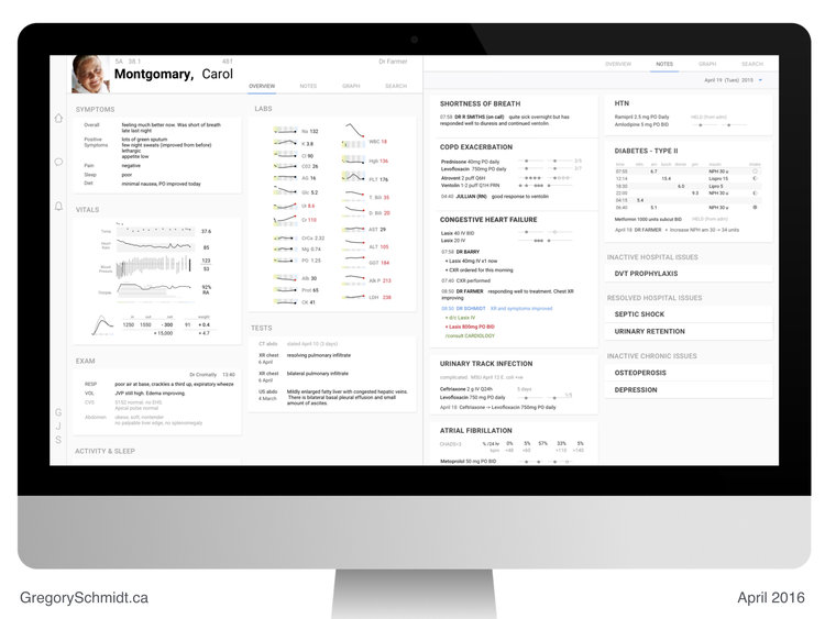
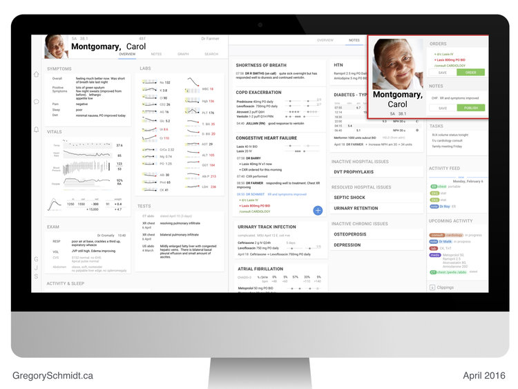
The first thing I want to draw you attention to is the split screen work space.
The ability to multi-task is one of the most crucial parts of medical workflows. One needs to be able to easily switch between notes, labs, and orders effortlessly; and view these concurrently. The difficulty switching between information types and inability to view them concurrently is one of the major gripes with current electronic medical systems.
Below, we see the Overview page on the left, and the Notes page on the right.
[note: the left side bar links to other parts of the medical record, such as messaging and notifications.]
The user has switched the left screen here to Graph view - a ‘sandbox’ tool we will discuss later.
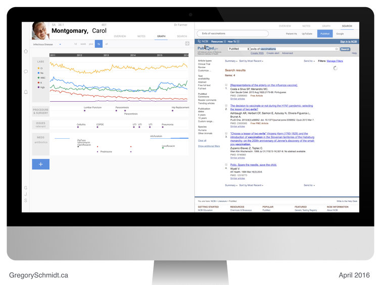
Search is the last tab in this mockup. The user can search either the patient chart, or ancillary information services such as UpTodate.
This medical record was designed to be used on a large monitor. Or even better, two large monitors. This provides four giant work spaces.

This split screen design may seem really intuitive and obvious. Arriving at it actually took the majority of the design time during the month. Many other layouts, all more complicated, were tried. They involved more tabs, folding panels, and windows. (I will post those inferior mockups in future.)
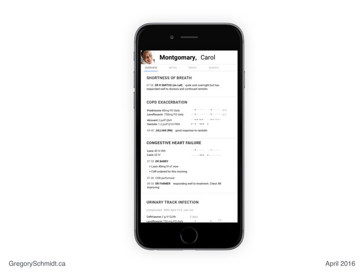
The interface is designed to collapse down to a mobile phone. The same four tabs are viewable at the top of the screen. Admittedly, not much time in this project was spent in optimizing the interface for mobile or tablet. The presumed ‘default’ interface for the project was a giant monitor. (The Oct 1 2018 presentation starts with mobile and tablets as the default display).
Printed notes adopt a similar layout to the screen. Making review of printed documentation legible and logical. This is the opposite of the unreadable junk that EHRs today produce when someone tries to print from them.
Everything within one click
Considerable effort was spent on a design that would summarize as much critical information on screen as possible, and place as much core functionality within one click.
The multiplicity of panels, windows, tabs, and clicks is a symptom of bad user interface design - and the patented ‘trade secrete’ (lol) of current medical record systems.
Here we see the patient’s recent Symptoms, Vitals, Exams, Labs, and Tests.
These two columns can slide down to easily view more static patient information.
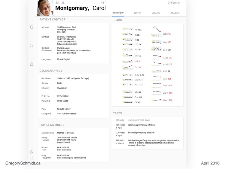
Slide down the left column to reveal the patient’s Contact information, Demographics, and Family Members.
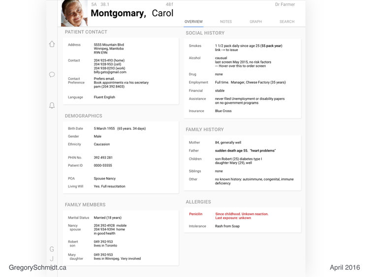
Slide down the right column to view the Social History, Family History, and Allergies.
Data in any of these fields can be updated by clicking on the respective box.
Return to the main screen by scrolling these columns back up.
[The content of these slider columns can be customized. But you get the idea: place this overview data on a slider / offset part of the slide offscreen / this makes it easy to access and easily adapts to multiple screen sizes, touch screen interfaces / and removes tabs and different windows.]
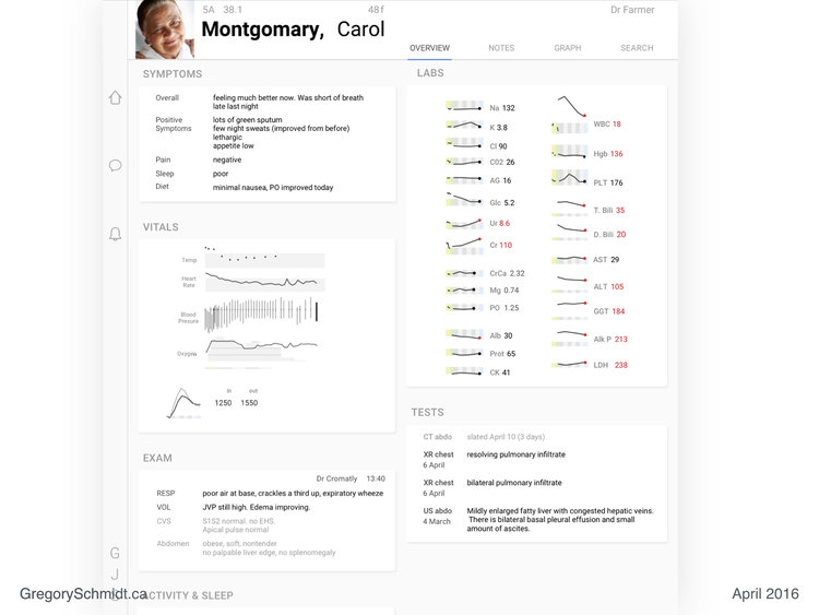
Data Density
A reoccurring theme of Edward Tufte is data density. Having more data per square inch provides greater understanding and insight into the story the data is telling. When done properly, increased data density does not create confusion, but actually provides clarity and makes it easier to see the signal above the noise. In many ways, this is why the Blumberg terminal is so great.
Let us focus on some of the panels from the Overview page on the left workspace.
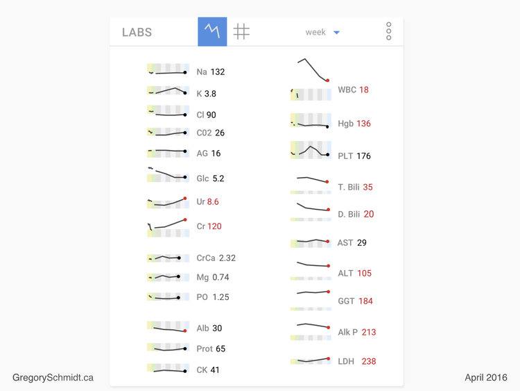
Lab Panel
This lab panel is strongly inspired (aka copied) from Edward Tufte's work on sparklines and the visual display of medical data.
We are easily able to look at over 450 discrete data points. 24 individual lab tests. A weeks worth of data. Plus the historical data from a year ago. All in one screen.
(The time range can easily be changed via the top bar. The sparklines can also be switched to a numerical grid if desired. This top bar is embarrassingly sloppy in its design….wow…very ugly and clumsy).
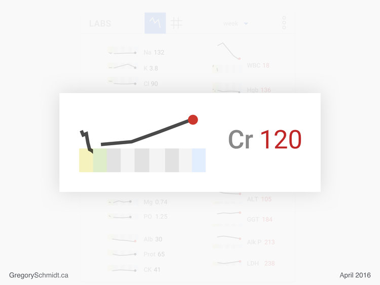
Let’s zoom in onto one lab, and dissect the design.
The yellow rectangle represents labs from a year ago. The green rectangle represents labs from the day of admission. The alternating grey boxes each represent a day of admission). The blue box represents the current date.
The height of this box represents the range of normal for the lab.
As you can see, the current value (red dot) of Creatinine, is just over twice the upper range of normal for this patient. Historically this patient’s Creatinine has always been above normal, even a year ago.
In this case the line is ‘solid’ representing reasonably frequent data during this time. In other sparklines above the data is more intermittent the line is broken to reflect this.
When a lab is out of range the dot at the end of the line and the number are represented in red. Placing the name of the lab in red as well makes the interface too busy.
Vital Panel
This vitals panel tries to demonstrate the same high level data density. I had a lot of fun building this.
Time, is represented (poorly) by a thin line underneath Oxygen. Again, the green box represents admission day, each alternating grey box represents another day of hospitalization, and today is the blue box.
Temperature, is represented with isolated measurements - discrete dots. The grey box behind this value represents the range of normal. The value on the right represents the most recent lab.
Heart rate is continuous data in this case. Therefore a solid trend line.
Blood pressure is a thin vertical line. The top of the line is the systolic pressure. The bottom of the line is the diastolic pressure. The slight dot on the line represents the mean arterial pressure. I really like this way of displaying blood pressure. At the time I designed this, I do not recall anyone else using this style. It really shows the trend well as well as the frequency of measurement.
Oxygen is displayed with the absolute value of oximitery as the continuous line, 92%. Currently the patient is on RA - room air. The grey shading superimposed behind this is the number of litres of oxygen the patient was on. The darker horizontal line through this represents increments of 5 litres. When the patient was admitted they were on over 15 litres of O2. This was titrated off over the next week. The user could display the FiO2 instead of number of litres. Either way, I am surprised I have not seen oxygen usage superimposed with oximetry before.
The lowest graphic in the bottom left, also represents a weeks worth of data. This graphic was designed by Alain Beaudry and solves the problem of trending a patient’s weight and fluid balance (which inevitably don’t always match well when viewed as absolute numbers on a daily basis).
The daily net gain/loss of a patient’s fluid balance is plotted on the graphic as a light grey line. The dark black line plots the daily net gain/loss in a patient’s weight.
The numbers in the chart represent the most recent day’s actual values, with the total change since admission in net fluid status and weight.
You can easily see that when the patient was admitted they gained both a net positive balance in fluid and total weight. (aka, they were resuscitated in the ICU). Then starting around day four they began to diurese - as confirmed by both their weight and fluid balance trending back towards their admission values.

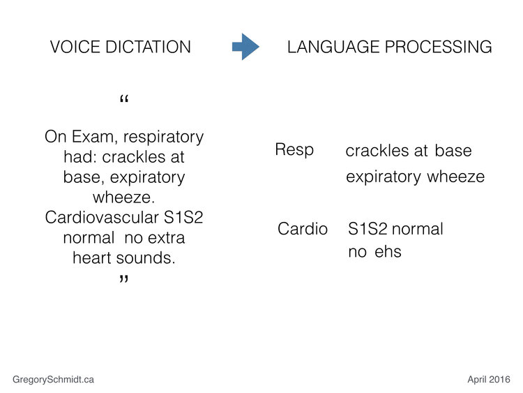
Voice Dictation
This slide was set to ‘hidden mode’ in the original 2016 presentation and therefore omitted at that time. As mentioned, I wanted to focus on presenting user interface suggestions that used existing technologies and didn’t ‘imagine the EHR of the future’, but instead ‘imagined how the EHR should function today’.
Since 2016, a number of startups have emerged that are working specifically on converting voice dictation into structure medical notes. I believe it is now OK to include this slide.
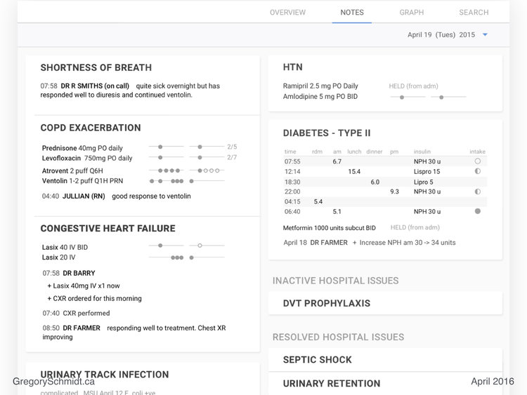
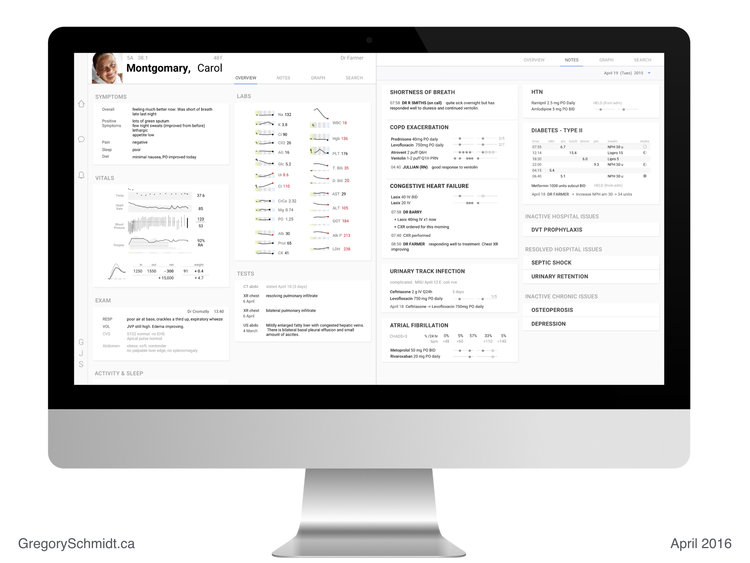
Notes Page
We will now turn our attention to the right workspace. The Notes page.
Medical Time Machine
The Notes page is currently set to today’s date. If the user were to ‘scroll’ that date backwards they would be able to see the ‘evolution’ of these notes over time. Changing this date, also scrubs the information on the left workspace, the Overview page, backwards in-sync with the Notes page.
This makes it really easy to ‘play the chart forward or backwards’ and see how the patient’s medical story unfolds. This is something that is very difficult to do on contemporary medical records.
Threaded Information / Integrated Notes
This sample patient shows the active issue they have in hospital at the moment, their past inactive hospital issues, and their previous resolved issues in hospital (collapsed).
These summary views, show all the relevant information: notes, labs, orders, medications, tests all threaded together.
This is very important.
Threading and integrating these data sets together provides a very quick overview and summary of each conditions. This also eliminates the need to open separate tabs, windows, and panels to view these data sources that in current EHRs are stored separately and not divided based on issue.
Diabetes physiologic display
The diabetes panel displays the glucose readings based on the way clinicians think about this data. For inexplicable reasons, medical record systems I have used simply display these values in a list, rather than based on time of day.
The diabetes display also integrates the ‘intake’ - the amount of food the patient ate. Represented with an empty, to filled circle. This is very important in interpreting the glucose reading relative to the insulin dosing.
Medication mini-line
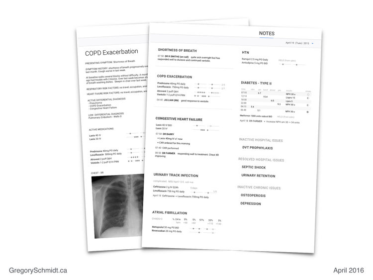
Let us look closely at the COPD Exacerbation summary panel.
Each medication is displayed with a corresponding “mini-line”. Each line represents a ‘day’. Two days of medications are displayed in this example - today and yesterday.
The filled in circles represent dispensed medications. The empty circle represent scheduled medications.
It is very easy to see the patient had a number of extra doses of Ventolin towards the end of yesterday.
The number at the end of the line represents the day of treatment, and the anticipated total duration of treatment. In the case of Prednisone, the patient is on day 2 of 5. In the case of Levofloxacin the patient is on day 2 of 7. The lack of a day at the end of the line represents no set ‘treatment duration’.
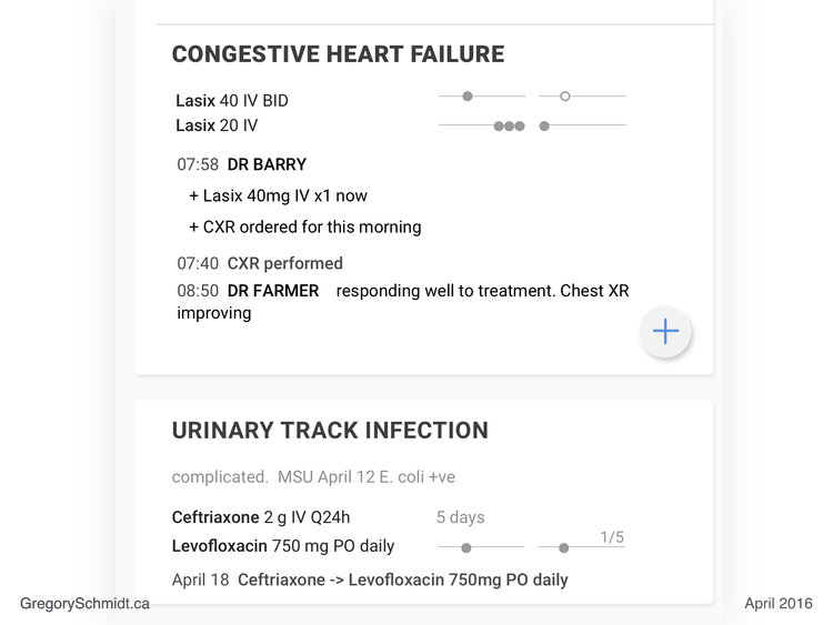
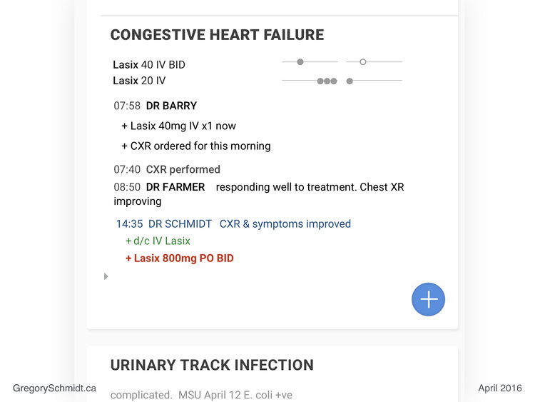
In-Line, In-Note Orders
The system is able to integrate both notes and orders together.
In this example on the Congestive Heart Failure Panel, Dr Barry ordered an IV dose of Lasix first thing this morning at 07:58hrs as well as a Chest X-Ray. There is no reason to write this first as a ‘note’ and then as an ‘order’. The order becomes the note.
The summary panel also demonstrates status updates - in this case - when the CXR was performed. (07:40 is an error, it should read 08:40).
Dr Farmer then wrote a brief note at 08:50, that the patient was improving. No need to write a long note describing ‘lasix was ordered, a chest XR was ordered’ - this information is already threaded into the issue’s documentation.
This documentation allows clinicians to focus on writing clinical impressions and summary statements, rather than repeating information. It speeds up documentation, and I believe can increase the quality of documentation.
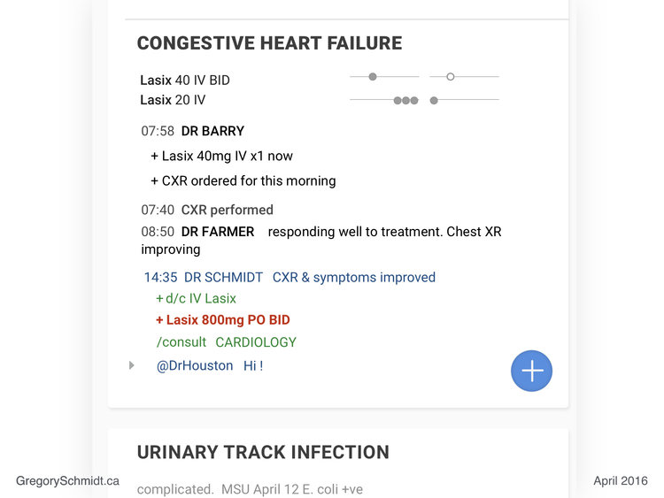
Clinical Markdown Language
When a user hovers over a summary panel - such as Congestive Heart Failure as seen above - a plus icon appear. By clicking on this icon, it converts the summary panel into a command line editor.
You can see a small arrow on the left, indicating where the cursor is at. In this case, Dr Schmidt added a note at 14:35 “CXR & symptoms improved”. Notes are automatically timestamped with date and user.
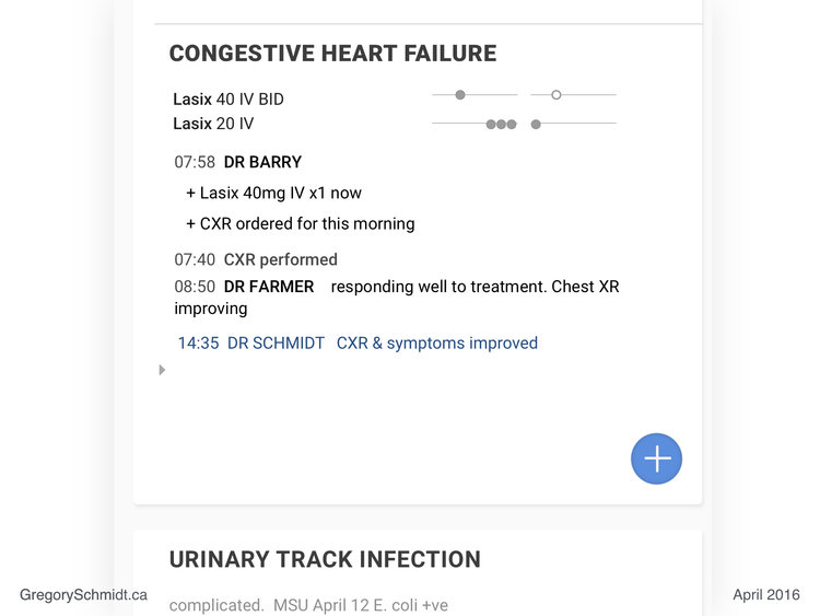
The command line editor uses a simply markup language.
To add an order, the user uses the markup key “+”. This alerts the system that an ‘order’ is going to be added. The clinician types in their order, such as to discontinue IV Lasix. The system parses the text entry order, recognizes it as a real order, and it therefore turns green.
The user then tried to write an order for: Lasix 800mg PO BID. Because this order was ‘not accepted’ it turns red and bold. (The dose is too high).
Other tools in the markup language involve the slash command. This allows the user to add consults. In this case for Cardiology.

Last we see the markup “@” symbol. This invites another clinician to this conversation, such as to ask a question or for an opinion.
[This markup language demonstrated is very primitive and underdeveloped. There are many things I would do different. Back in 2016, the only mainstream system I knew that was using markup was Wordpress text editors and Wikipedia.
Since then markup language in everyday software has become much more common. (ClickUp uses slash command particularly well, example here.)
Keyboard entry and markup allows users to navigate the system very quickly and avoid mouses, menus, buttons, and windows. This method of user interface navigation is ideal for the super user who knows that mouse entry is slow. I fully admit that it is not for everyone, and most people will rely on icons to navigate.
However, real time markup languages are awesome. You can use this to essentially allow users to ‘auto format’ a note as the write it in ‘free text entry’ (the format people like). But it can result in a highly structured piece of documentation. Real time markup can essentially eliminate all radial buttons, dropdown, and menus that plague note generation in current EHRs. Yet another topic for another post.
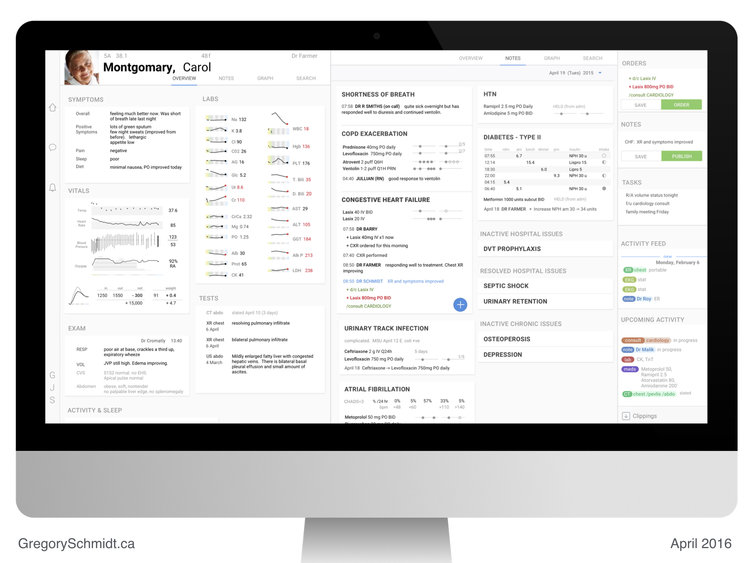
Task Panel
Press the keyboard’s ‘tab’ key to toggle on/off the Task Panel. Toggling the side task panel on/off, is a feature in Adobe Lightroom that I really like. Hence, why it was adopted for this interface.
The task panel holds a draft of the current orders and notes. These can be saved to work on later (or be reviewed by someone else before submission).
The task panel also includes the to-do list for the user that is shared among the other users in their work-group.
The activity feed shows the past and upcoming activity for that patient. It incorporates everything - imaging, labs, notes, consults, medications, etc. Scrolling this feed lets the user easily see what has happened to the patient, and what is upcoming. This feed can be filtered. When any item in the feed is selected, it links to that source document. There is also a way to ‘scrub’ through the activity feed, and have it update the Overview Workspace and Notes Workspace (similar to Medical Time Machine discussed above).
Clippings - located at the bottom of the task panel, Clippings expands to show all the parts of the medical record that the user has ‘highlighted’ and ‘bookmarked’ to view later. These may be used in a note, or a collection of clippings may be bundled together to pass onto a consultant for review.
Medication Safety
The major source of medication error in electronic medical records is placing orders on the wrong patient’s chart. When the user clicks on the order submit button, the interface displays adjacent to that button a large picture of the patient, their age, name, and room location.
(I experimented a fair bit with different ways to create ‘unique visual patterns’ that are viable in the peripheral vision of a user that are unique to the patient and provide a ‘sixth sense’ and ‘subconscious’ sensation for the user that they have the right (or wrong) chart open. Visually these ended up looking ugly, and were not included in these drafts. Again, another topic for another post.)
Rational use of colors
Contemporary EHRs use too many colors and skeuomorphic icon design.
The color scheme for this EHR is deliberate. The color palate is neutral. This is reduces busyness and clutter. Whenever color is used it is deliberate. (Admittedly, I screwed up in the above design in the Action Panel…the color bubbles for different data types should be removed…).
But original intent in these mockups were:
Green - whenever an actionable next step is present
Blue - navigation tools
Red - used only to draw the user’s eye to important details such as abnormal labs, or notifications. I actually think I overused it.
Data Capsule
When the user clicks the COPD Exacerbation summary panel, it opens the COPD data capsule.
The data capsule concept is my favourite part of the EHR. I talk about it all the time.
I honestly cannot remember anymore how much of this idea I independently came up with before vs after reading the works of Dr. Wehlou. Regardless, data capsules are critical to proper EHR design.
In this example for COPD, the Data capsule shows all of the information you would like to see on this issue. It lists the care team, the active medications, the prior medications, the relevant tests (in this case pulmonary function tests and chest x-rays).
The relevant tests are ‘automatically’ pulled into the data capsule. Meaning, if a chest x-ray was done for pneumonia elsewhere, it will be added to the patient’s COPD capsule, because the capsule auto-imports tests that are relevant.
All notes (and their threaded/corresponding orders) related to COPD are listed in this capsule by time. This means both outpatient notes, walk-in notes, and in-patient notes related to COPD are all in one timeline.
When the patient moves from in-patient to out-patient their ‘data capsule’ moves between these locations. This makes it easy for new-clinicians to open the capsule, see what is going on with the issue, make updates and changes to it, document this, and make it very easy for the next clinician who opens the same capsule at a later time.
Care team members can also set alerts, so that they are notified perhaps only when the data in a certain capsule is change. For instance, a rheumatologist may want to be notified when the medications in a capsule for a patient with advanced rheumatoid arthritis are changed.
This means they are notified when something they care about happens… as opposed to the current state, where clinicians indiscriminately cc each other every time the patient is seen, making it difficult to follow relevant updates, or track changes to issues.
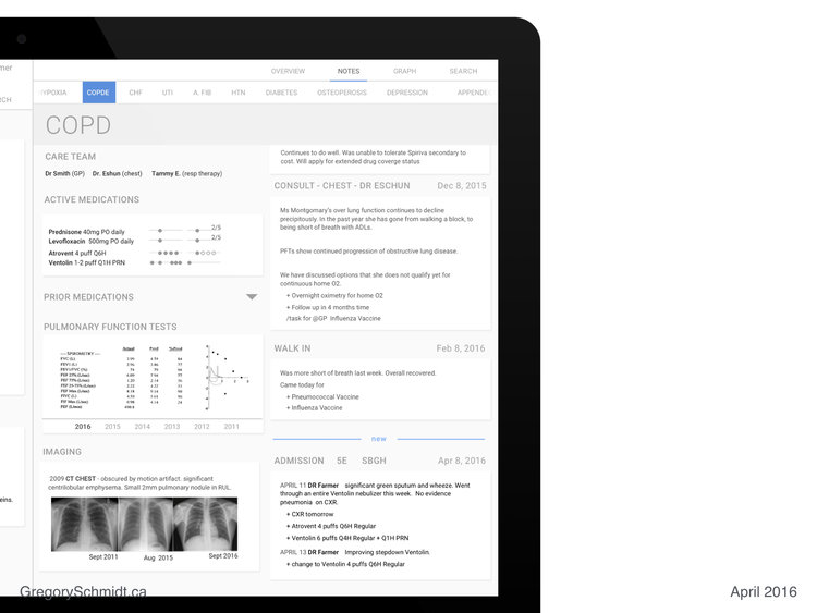
The top navigation bar in the above example allows the user to easily move between Issues, and their data capsule’s.
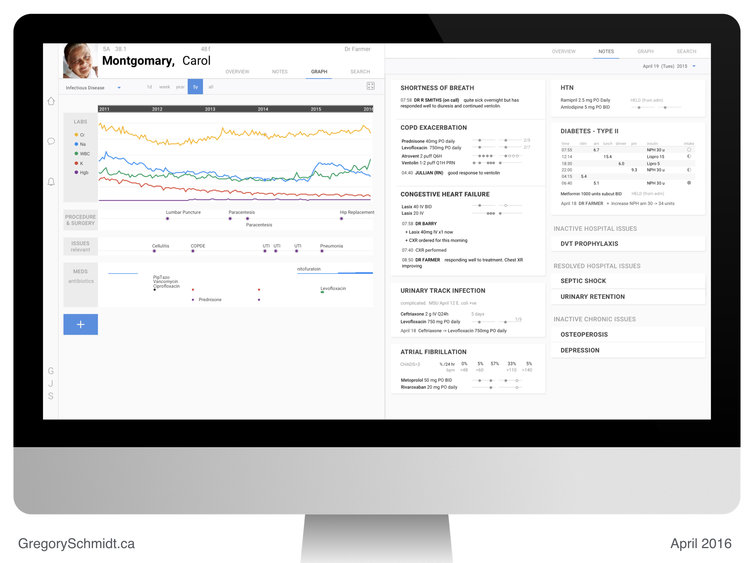
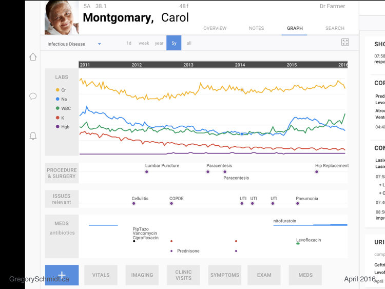
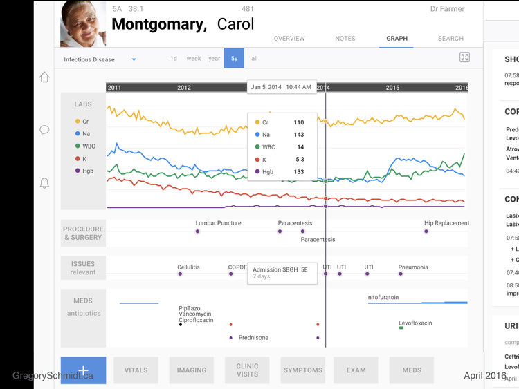
The Sandbox
Let us now switch to the Graph Workspace, that I call ‘the sandbox’.
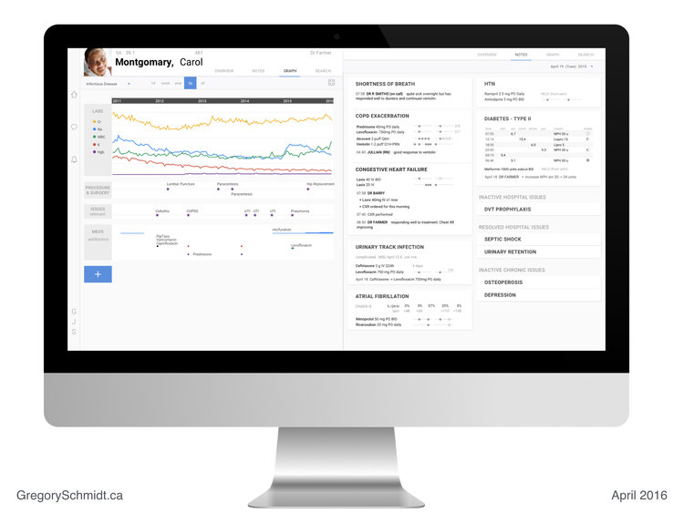
The sandbox can be ‘pre-configured’. In this case, the user has it set to the ‘infectious disease view’ for the last 5 years’.
In this case we see relevant labs, procedures & surgeries, issue, and medications that are specific to the default view - Infectious Disease.
(Dr Jonathan Gold has made the very astute suggestion that the order of these sections should mirror that of the consult note… issues / meds at top, then labs for instance).
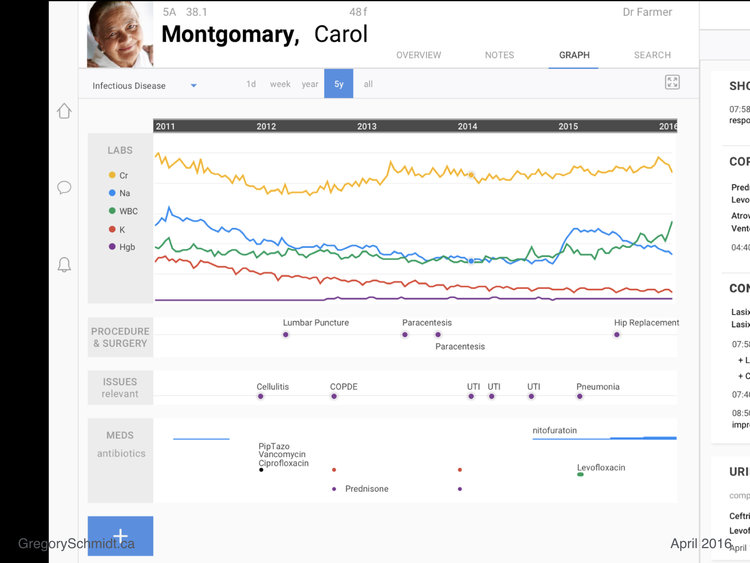
The sandbox is designed to be an interactive workspace where clinicians not only are able to see ‘what is going on’, but also help test theories and manipulate the data within a patient’s chart in a logical manner to help answer their questions. That is why there is a button in the top right to make it ‘fullscreen’.
The user can also add any other data field they want that will help them understand the patient’s story. Vitals, imaging, clinic visits, symptoms, exam findings, etc.
Clicking on a particular item brings a hairline that cuts across the data elements and expands details about them.
Note: in the medication section, a single dot represents a single dose. The thickness of the medication line represents the relative dose. As you can see the dose of nitrofurantoin was increased with time.
Real Electronic Health Record Screenshots
This section was to show pictures of actual electronic health records, in order to contrast the current state, with the above mockups.

At the time when I build this presentation in 2016, I did not realize that EHR companies sue clinicians that show screenshots of their user interfaces. Therefore, slides will not be uploaded showing the sorry state of real electronic health record systems.
In short - the systems are horrible. Large parts of the screen contain no useable data. The data density is easily several hundred fold lower than proposed designs above.
The interfaces are cluttered, confusing, full of tabs, windows, popups, radial buttons, drop down menus, side bars, top bars, bottom bars, checkboxes, and graphics-junk. If you work in a hospital, you know what I am talking about.
Summary
This project has tried to show how an electronic healthcare record can be designed with an efficient layout, high data density, and data capsules.
These were not meant to be production ready mockups, but more concept level mockups.
Obviously they would require far more details and refinement to go into development. They also leave out many other functions within an EHR, simply as this was supposed to originally be a 10 minute presentation when delivered in 2016. There remain a few more semi-complete mockups in Sketch, that in the future I will post separately.
Start a Discussion
If you enjoyed this presentation, please share with your friends and colleagues.
This presentation is meant to start a discussion, rather than suggest a final endpoint. We need more focused discussion around electronic health record interfaces.
Unfortunately traditional legacy EHR vendors have essentially created a gag order making it ‘illegal’ to discuss their bad user interfaces. (Several posts on their predatory practices preventing physicians from posting, discussing, and doing research on their poor electronic health record designs will be forthcoming).
As mentioned, these mockups are old - April 2016 - and my first kick at the can. After two years of clinical work on the wards, I once again have the opportunity to get back into EHR design.
Most recently, this has resulted in the October 1, 2018 - EHR Design From First Principles presentation - available on YouTube (preferred way to watch it), and slides as blogpost (here).
As always, please send feedback, or if you would just like to talk about EHR design, to gschmidt@medmb.ca Twitter: @_GregSchmidt