Part 1: A multi-tasking, multi-screen interface from first principles
Technology Prolog: All of our users use a Google Chrome browser. This simplifies our development, and allows us to use the most up-to-date HTML and CSS touch interaction events.
These designers were made with with Google Material Design as the foundational components. It has good documentation and standardization.
TABLET ORIENTATION
Let’s start from largest elements and work inward, and use the device that is most prevalent in our clinics – the tablet.
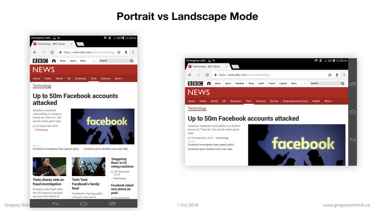
Should we hold it in Landscape or Portrait mode?
When it comes to reading, the eyes prefer to scroll and block text vertically. We should prioritize vertical space. This is in part why newspaper columns are tall and vertical. When the page becomes too wide it is actually rather hard to read.
Prioritizing vertical space also reduced amount of times the user has to click the screen to scroll.
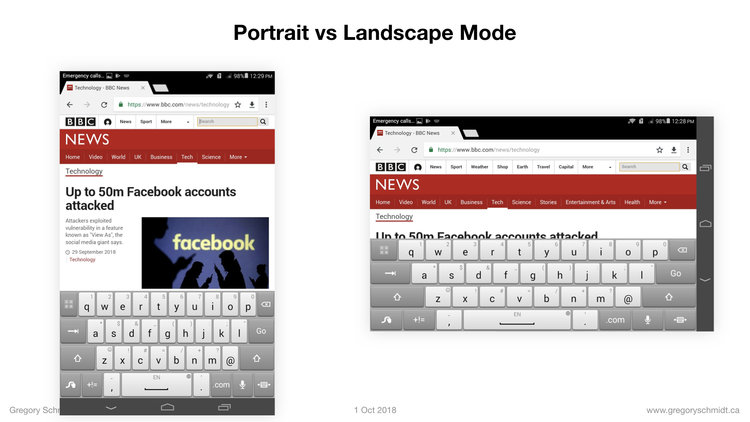
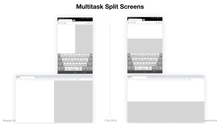
We know that users at times need the keyboard. As you can see, when the keyboard is activated on this Huawei 8’’ tablet the tablet in landscape mode becomes essentially unusable.
Ok - Portrait orientation it is.
MULTITASK
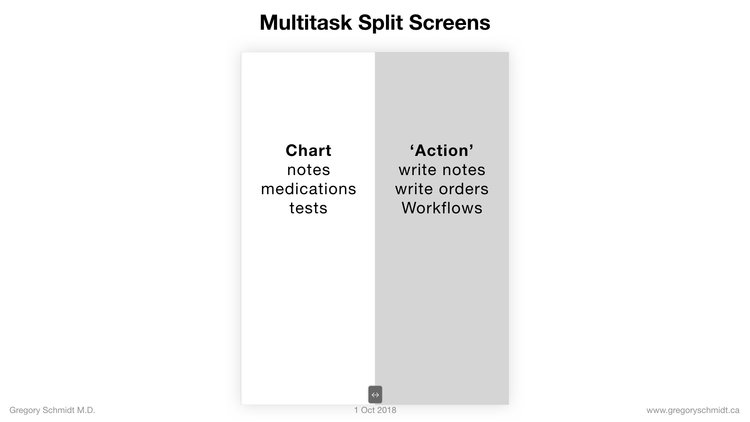
Users need to be able to multi-task; meaning review chart information at the same time as they write notes or place orders.
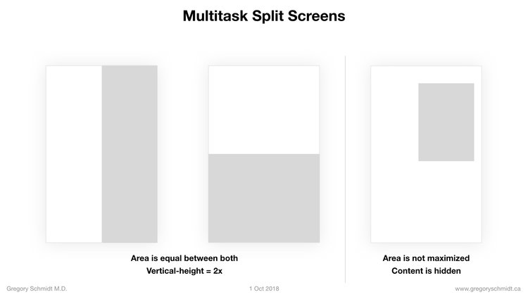
There are a few ways this can be done, splitting the screen vertically, horizontally, and overlaying a second window.
The trouble with overlaying a second window is its harder to render in chrome browser, it covers content below, and it does not maximize screen space as there is gaps between the overlay and the edge.
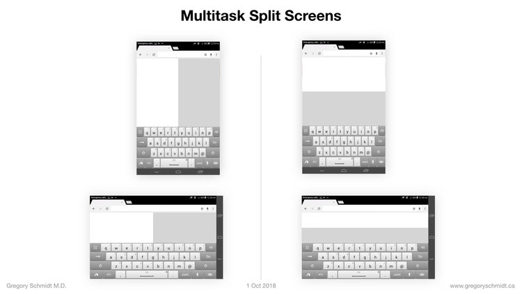
Lets look at vertical and horizontal splits with a keyboard.
The landscape mode is essentially unusable, and holding the tablet in portrait mode results in 1.48x more usable space.
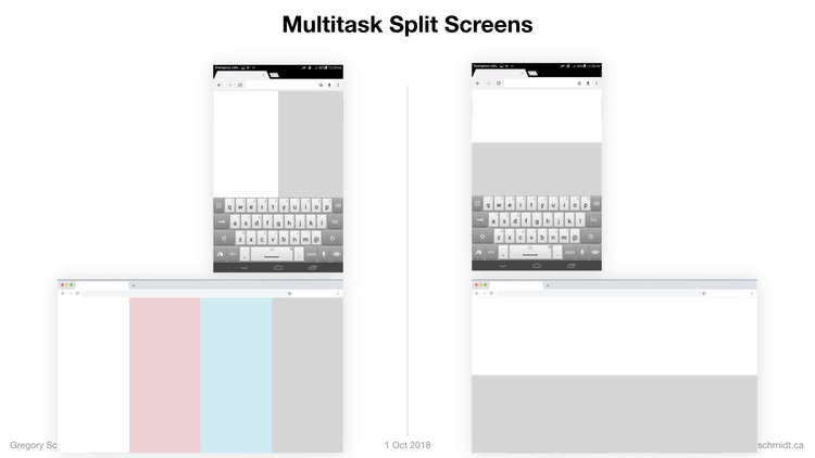
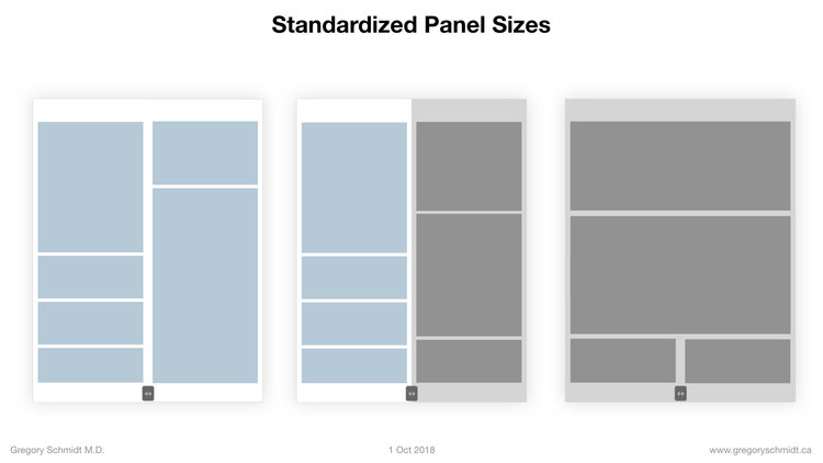
When we look at split screen on chromebook and desktop, a vertical split creates more usable vertical-space.
In addition, it allows the user to expand three, or four multitasking work spaces – that share the same general box size. The UX designer can use two of these vertical spaces together (so that the one on the left is an ‘index’ / menu and controls the one on the right. Or the vertical spaces can each be used independently creating (four in this example) independent multitasking spaces.
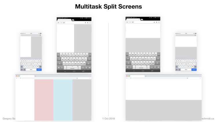
On mobile, splitting the screen vertically does not work. The panels are too narrow. But there is an elegant work around that has become popular in the last few years, an expandable “bottom drawer”.
The second large advantage of using the bottom drawer on mobile is it allows us to retain the same panel size shape (generally a tall rectangle) on tablet and desktop.
Let’s say the green is the ‘patient chart area’, and copy that structure to phone. Then we can take the purple panel, lets say that is the ‘active area’ to write notes and orders, it can be overlayed a second panel on top of the first and rest at the bottom.
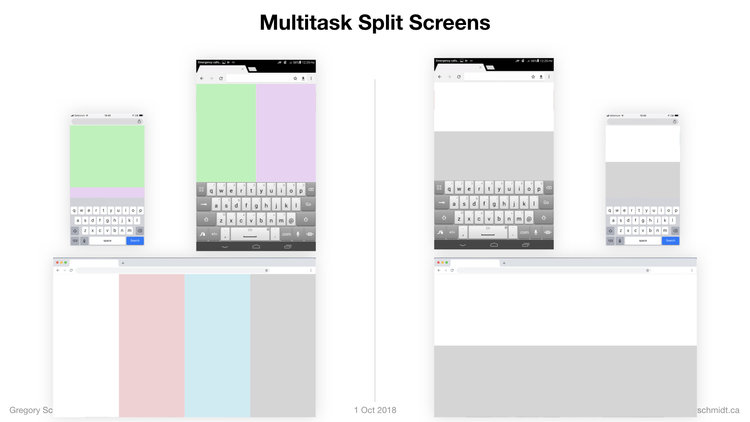
When needed, the activity panel can be pulled up to half of the screen, or fullscreen.

Bottom drawers are becoming increasingly common. Both Apple and Google Maps now use them.
Moving the panels
The panels can be adjusted by a single button at the bottom of the screen that can be swiped left or right.
To review,
It is best to split the screen vertical.
The user can also expand the half-screen to full screen using a bottom button.
When expanded we can tile the screen panels in two columns. Or the panels can scale to the entire width of the screen.
This approach works well on desktop and tablet. On mobile it is best to use a bottom drawer.
Further discussion on the benefits of tiling responsive designs is outside scope of this presentation.
Navigation Bar Placement
Now that we have the layout, where does the navigation bars go? Top or Bottom vs sides?
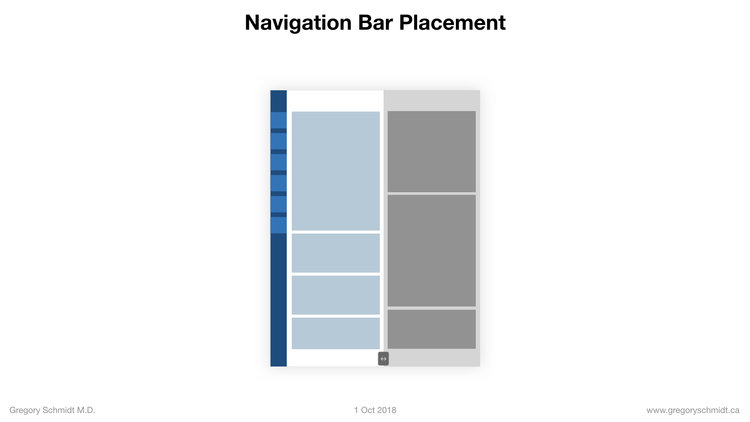
If they are placed on the side, it will reduce the already narrow screen real-estate in 8’’ tablet split-screen mode. Also using a side navigation means we can only show an icon, and in order to display the text the user has to open the panel.
This leaves us to place navigation either at the top or at the bottom. But which one? Most apps have gone to having bottom navigation trays, because that is where the active or ‘hot’ area is on the screen that one’s finger can reach. And I’ve been a big proponent of bottom bar navigation – for years before Google (finally) got on board.
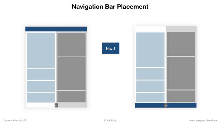
However, the one problem of bottom bar navigation is that it makes it difficult to have a second navigation bar that is secondary to the primary bar. It is not as intuitive that the bar on the very bottom of the app edits the bar right above it.
In addition, if we add a third bar – bar 3 – that changes based on the specific content displayed it becomes a bit less intuitive.
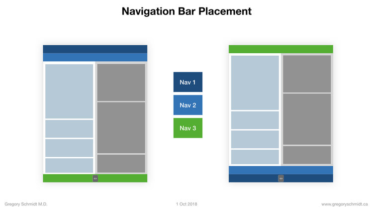
In particular, when displayed on a desktop, most users expect the top bar to be the primary, and the bar underneath that to be secondary, and the bar near the bottom to be specific to the content.
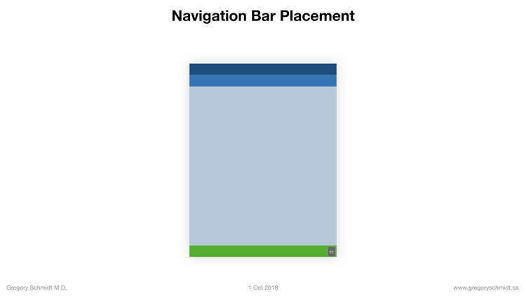
As we see in the summary - I believe the most intuitive arrangement is the two navigation bars at the top. And the third control bar at the bottom.
Navigation Bar Style
There has been movement to be very explicit with navigation buttons. No longer do we use only icons – but text is preferred. This is good because it makes it very explicit what the button does.
You can see in the upcoming example of Twitter’s 2nd navigation bar, or by opening almost any decent app.
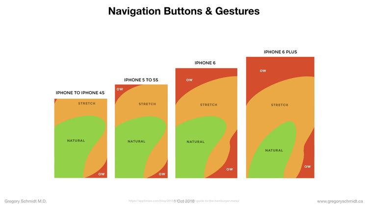
Navigation Gestures
As mentioned, the reason most apps have gone to a bottom bar navigation is because it allows the user to change the screen easier, as the buttons are within the active area. This image from Apptimize underscores this.
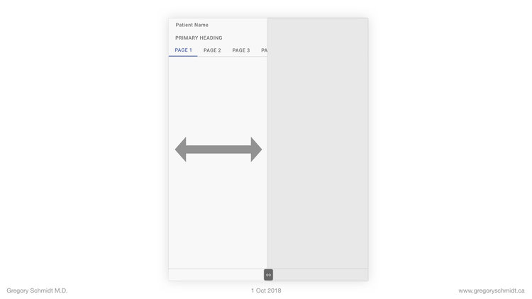
However, some apps have gotten around this by allowing users to control a navigation bar at near the top of the screen via swiping left and right on the screen.
This is an example from Twitter, it is incredibly easy and fast to navigate because you can swipe left or right.
If the user wants they can select each button. But this is much slower than swiping.
This is the same screen swipe style on an Amazon Fire.
An a last example using the iPhone camera app.
Cartesinal Navigation
I have really fallen in love with how fast this navigation style. I call it Cartesianal Navigation - where you can control the entire app via up/down, left/right swipes with pressing on the screen content.
This central out navigation style is the opposite of traditional interfaces where the interfaces is placed at the outside of the app, and you always moved to the periphery of the screen to navigate.
Another example from Twitter.
Navigation Bar - Width
The buttons of the navigation bar can easily float offscreen.
This format of horizontal navigation menus that exceed the phone’s width works very well on tablet and on desktop.
For this reason there has been trend to include this on more website. In particular Google has been using this on more parts of their search results in the past year. Apple’s iOS 12 update from last month also included more components with a horizontal scroll feature.
An example from the phone, tablet, and desktop below.
We are fortunate that Touch Events in Google Chrome make this type of interface possible.
Final Touches
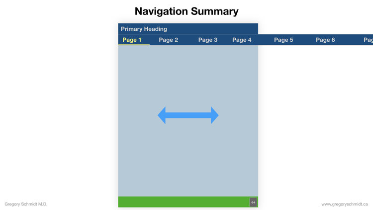
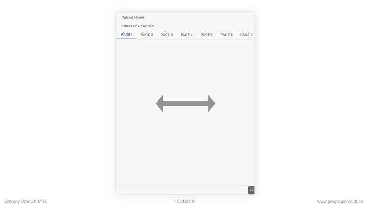
Putting it all together, we have a primary heading, a secondary heading that swipes left and right, and a bottom menu bar.
Its not the late 90s, so lets fix these colors.
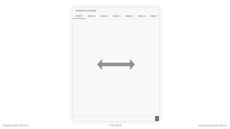
We’ll add a patient name

To Summarize
1. Portrait mode is best to optimize vertical space available for reading and working.
2. Splitting the screen vertically creates a panel size that
(a) respects the preference for vertical height
(b) works well in tablet and desktop
(c) is a shape that can easily be expanded in width to work on a desktop, or can be tiled side-by-side on desktop to create multiple workspaces
(d) in split-screen mode is approximately the same size as the width of the mobile phone. Therefore the design elements for one, will work on the other
(e) on the phone, overlaying the vertical split panels to create a bottom navigation drawer is best
3. Placing the top 2 Navigation bars at the top of the screen, with the third bar at the bottom is the most intuitive way to understand the content hierarchy.
4. The navigation menu at the top of the screen can be controlled by swiping the content left and right. This is incredibly fast to cycle through the navigation pages.
5. The navigation menu should be in text (not icons), and it is OK that it floats off the phone screen edge, because this will display better on tablet, and fine on desktop.
—> NEXT, MOVE ONTO: Part 2: A single user Interface to group clinical data 6+ ways
CHAPTERS: EHR Mockup Presentation Oct 1, 2018
Best to read in order, or even better - watch the video:
Introduction: EHR Design Mockup - Oct 1 2018
EHR Requirements: Many different users & devices
Part 1: Multi-Screen & Multi-Tasking EHR UI from First Principles
Part 2: A single user Interface to group clinical data 6+ ways
Part 3: Electronic Medical Record Interface Panel Ideas
Please note: these designs are simply a ‘slice in time’. The project as of Oct 1. They are in no ways a ‘final version’. There are many things I do not like about these in their current state as published.. Also, the design focus here has been on functionality. The designs have not be optimized yet for esthetic design.