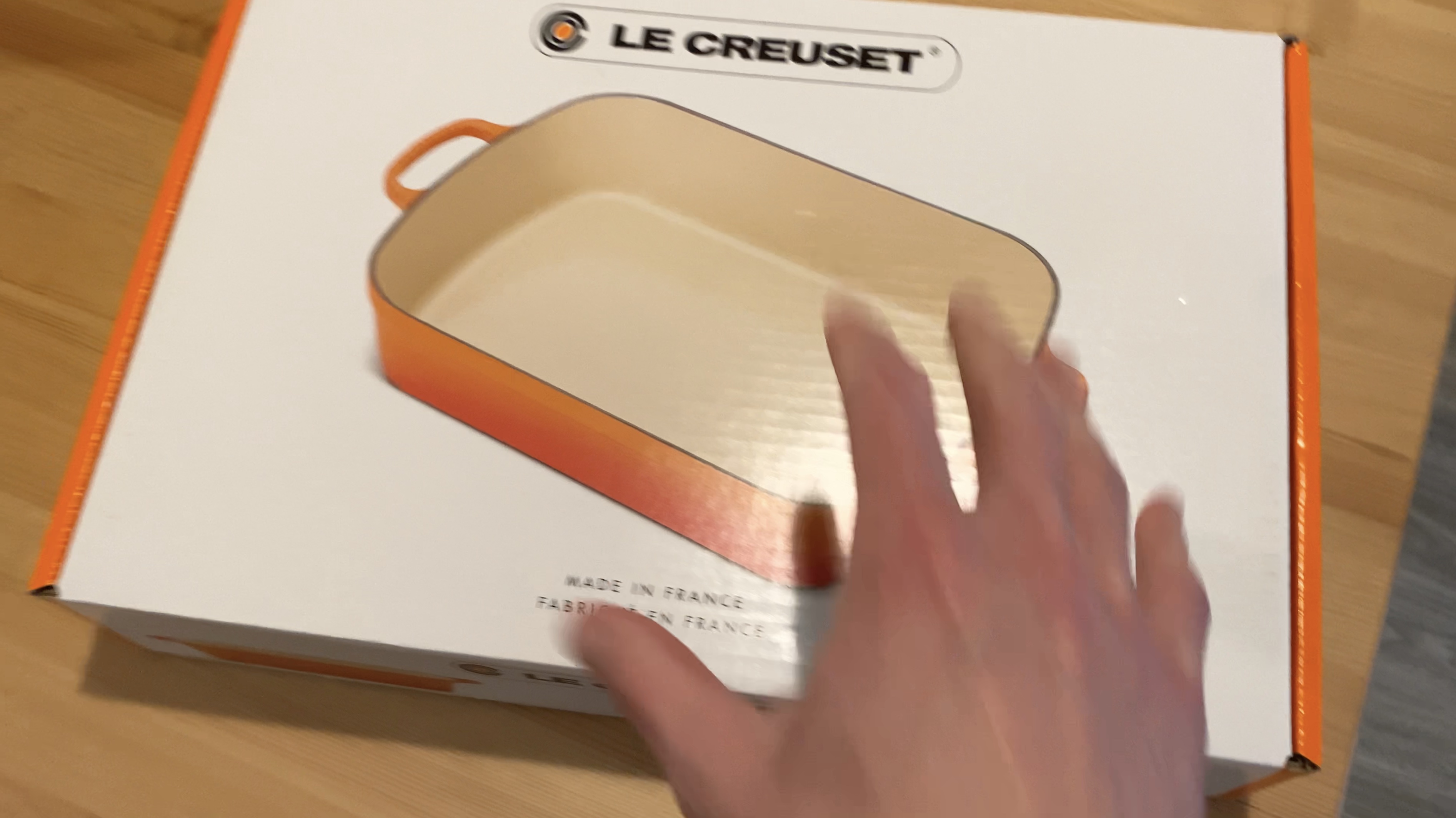
My wife and I received some pots for our wedding, and we both managed to rip open the cardboard box from the wrong side. Given that we both made the same mistake, I wonder if this may be a common issue.
When I was opening the cardboard box, from what turned out to be the wrong side, it was actually quite difficult. The flaps did not want to move easily, and I ended up tearing the box, despite trying to be careful. For some reason, I thought that this is what it should feel like to open this box. The pots are extremely solid, and I assumed that the box must also be solid and very tightly held together.

It didn't occur to me, until we had difficulty on the third box, that we may be doing something wrong. Which was we were opening it from the back, rather than the front.
As the video with this post illustrates, the design flaw is potentially related to how the box is opened in contemporary use. The boxes contain heavy pots, and we lifted the box from the shipping box on the floor to the table. As the boxes are heavy, at no point during the process were we at eye level with it.
When viewed from the top, it is not immediately clear which side of the box to open, and when starting to open the wrong side, it is not obvious from looking at the flap that I picked the wrong side to open.

Solution
Ideally, there would be more prominent cues to make it more clear which flap should be opened.
Currently, the box has a small cut-away on the correct flap that reveals the orange part of the box underneath. The trouble is that this isn't clearly visible when viewed from the top, which was how we opened the heavy boxes.
Some potential ideas
- A visual queue on the top of the box, such as a small arrow and/or the word "open" in small print along the top of the box on the correct flap - something to suggest that one should direct their attention to a particular flap.
- The flap that does not open could be colored the same orange as the side of the box, to make it more evident that it was the backside.
- An elegant ribbon could flow out of the box from the side that is meant to be opened. It doesn't have to stick out very far, only an inch perhaps but it would be clear that is the side to start into.
I suspect a study of shoe boxes and other boxes could provide further ideas.
Avoiding the problem altogether.
Another potential solution is to assume that people will open whichever side they please and design the flaps so that either side of the box is equally easy to open. I'm not sure how this would compromise the stability of the box too much, but if the box was sufficiently stable, this might be the most preferred solution. This solution would require no extra 'visual design' to try and force people to act differently, but instead, it would take into consideration how people act and adapt to meet their behaviour.