Finally ! I have found an intuitive and easy to follow hospital directions system. The ‘Route Number System’. We will review this at the end of this post (Part 5).
But first, let’s look at the disaster modern hospital signage has become. “… the popular (yet misguided) addition of colors and tones, brighter and bolder patterns, cartoons and photos, textures, lines, arrows, and 3D effects. Although well intentioned it clutters and impairs the message….” as we will see…this describes both chartjunk & navjunk.
(P.S. Have photos of navjunk? Please share @_GregSchmidt or gschmidt@medmb.ca)
Part 1:
Current hospital navigation
1.1 Need for clear directions
Everyone has a different term for how to help people get around a hospital: navigation / directions / maps / way-finding / wayfinding.
Hospitals are complex buildings that have been expanded and renovated, with new buildings built upon each other over decades. Finding one’s way around this labyrinth is tricky.
To help make directions clearer, many hospitals have undergone ‘wayfinding’ upgrades. Perhaps it is better than the previous signs, but I think often the result is less than desirable.
Lets look at this…
1.2 Rapid growth of wayfinding
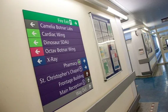
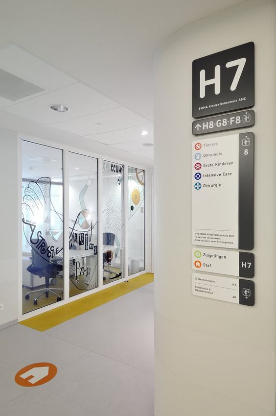
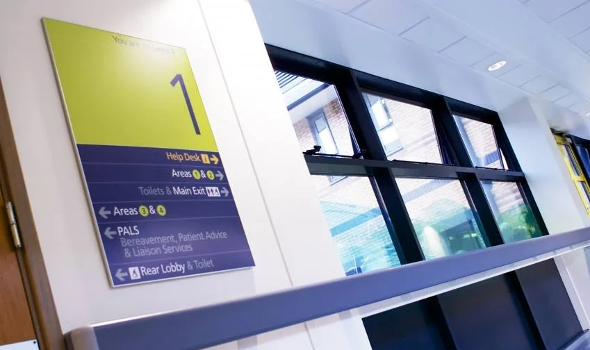
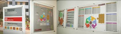
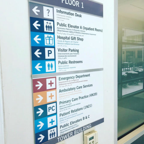
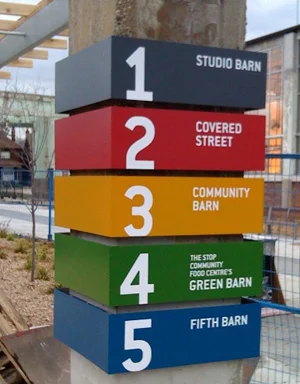
As a way to help ‘improve directions’ it seems the predominate contemporary ideology is to make signs bigger, brighter, bolder, and more colored. It involves adding more arrows, lines, cartoons, pictures, and photos.
The line of thinking is… ‘if we can make each unit and department look different it will make it more memorable’. (uh ok…but how does this make getting to it easier?)
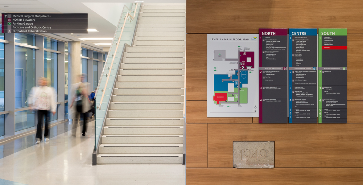
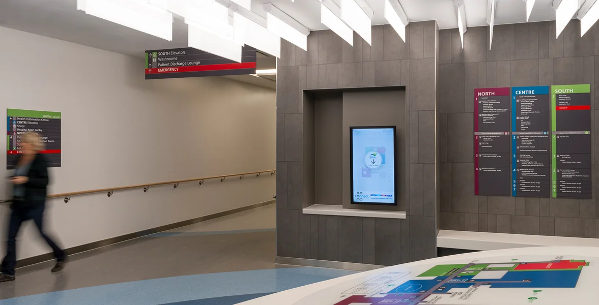
Therefore, we find that instead of having Traditional floor plans such as:
Building Name / Wing (north, south, etc) / Level 1, 2, 3, etc / Department Title
We now have things like
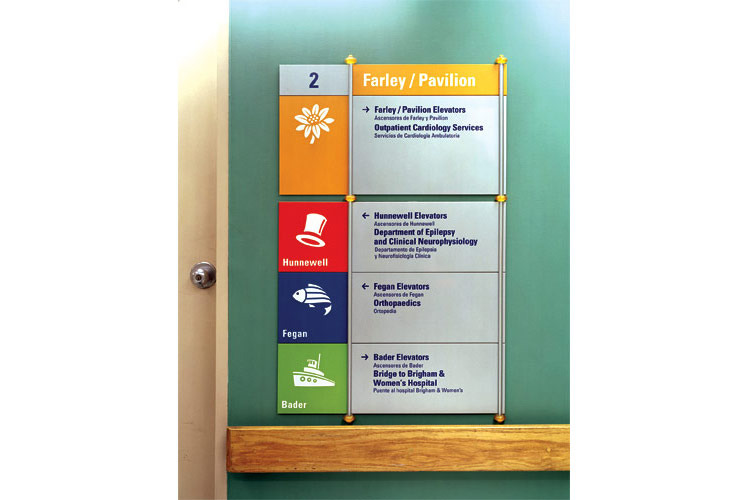
Cardiology clinic in purple-polar bear
or
Unit B in Green-Owl in Orange-striped zone.
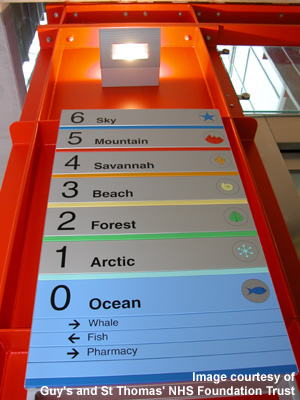
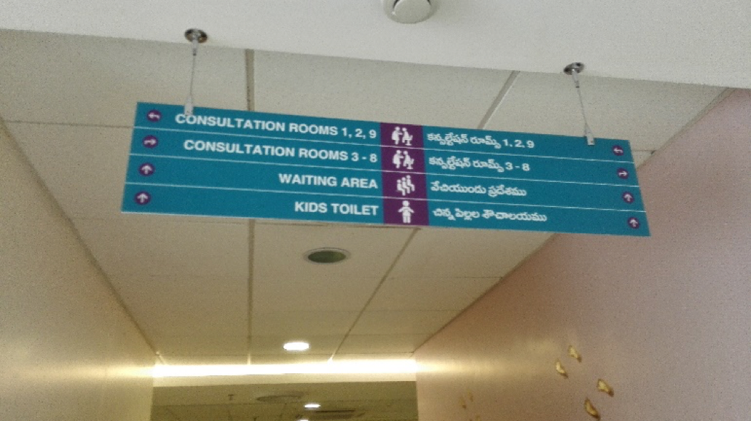
Below are some actual geographic area titles. ‘Green Owl’. ‘Yellow Deer’. ‘Pink Goose’. Can you guess which of the are on level 1 vs level 2. Or which are beside each other vs an entirely seperate building? [Also…“teal fish”…how many people even know what color teal is…. Why couldn’t the fox have been called Red Fox? I think ‘Magenta Fox’ is far less ‘accessible’ for people to understand]

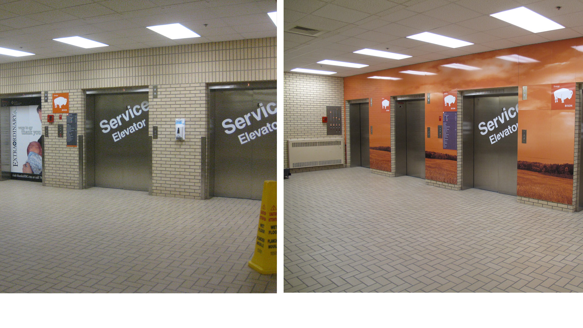
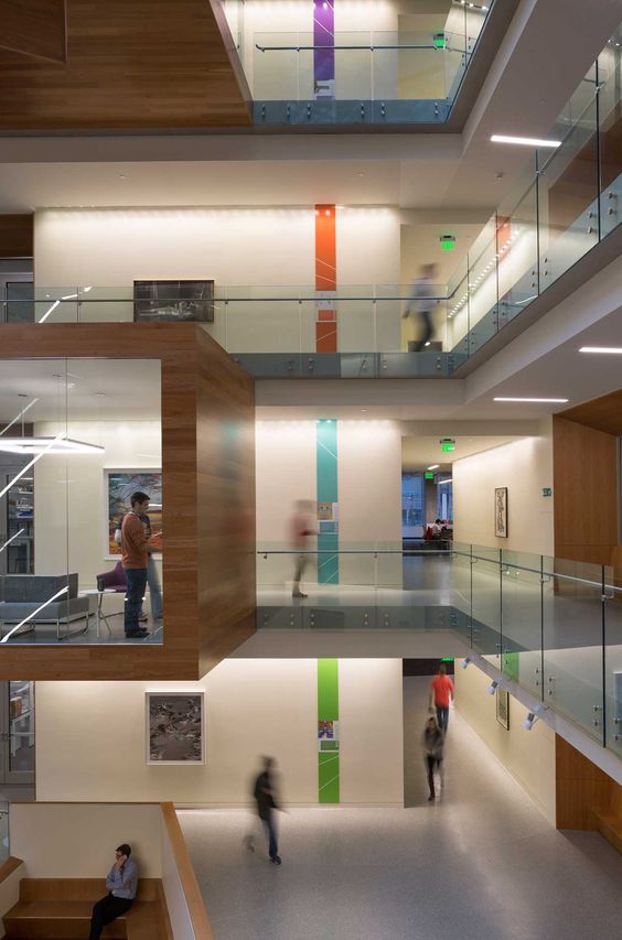
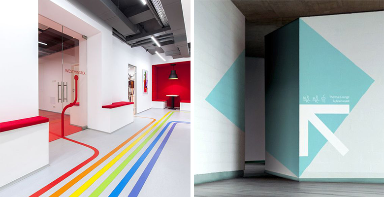
To match the silly name changes, ‘modern wayfinding ideology’ requires the entrances to these clinics and units be decorated floor to ceiling in an over the top manner to reflect their ‘unique name’. (Cringe at the many examples in photo portfolio below).

Two comments…
First - these animal/color associations are ridiculous. They don’t even make sense. Did these designers fail elementary school?
Second - how does placing the focus that a Unit is in ‘the green-owl part’ of the hospital, or in the ‘orange-deer part’ of the hospital add value to the user in helping understand how to get there These name/color/picture associations do not help the user know which sections are within the same building, or close beside each other.

Click to enlarge some examples of such ‘modern wayfinding’ ideology from hospitals:


Part 2:
The new navigation names suck.
Lets add arrows and lines.
As we discussed, making the unit entrances different from each other does not actually improve the ability to know where in a hospital complex that new tacky entrance is.
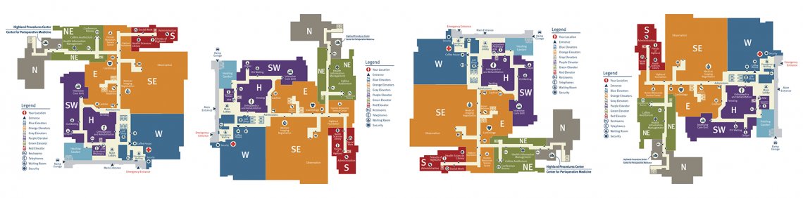
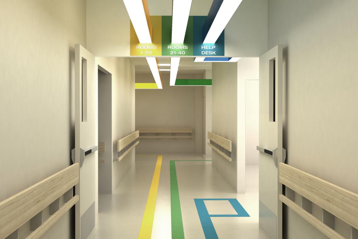
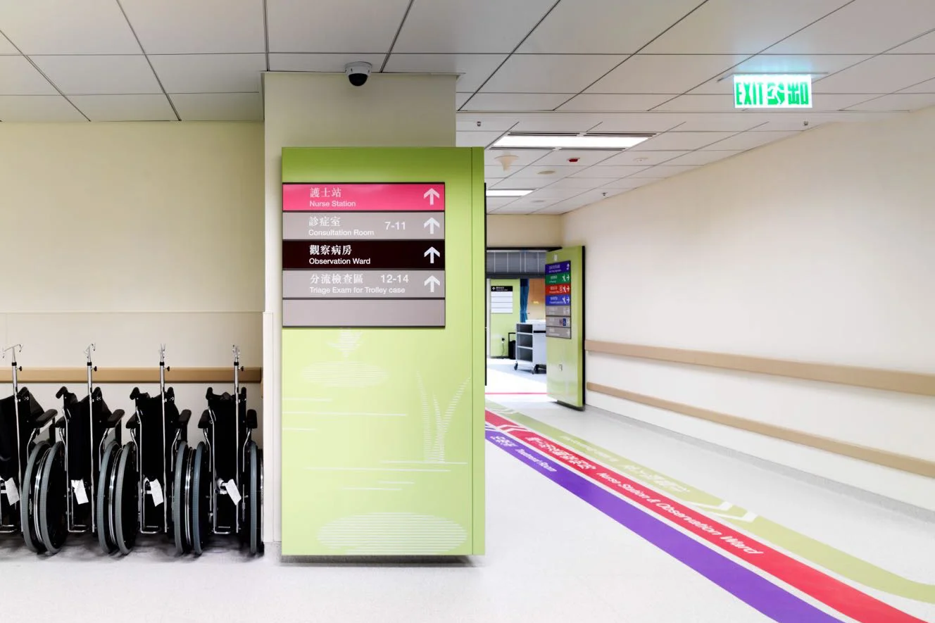
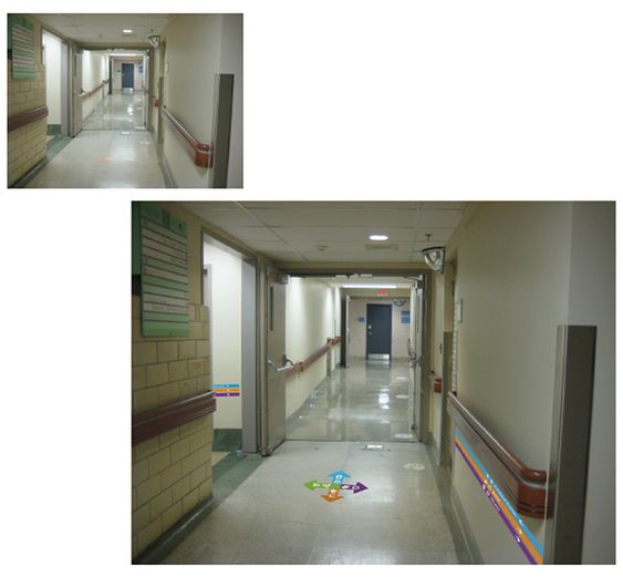
Therefore, the workaround that wayplanning vigilantes have adopted is to install larger & bolder signs than ever before combined with lines and arrows. These lines run up and down the floors, walls, and even ceilings.
The problem with these navigation lines is twofold.
- It eats up a lot of floor and wall space. This changes the aesthetics of the place, and really adds to the busyness of the interior design.
- There are always more units and departments than space for floor and wall arrows allow. This means that the majority of departments cannot be linked to a unique floor navigation line. This is why only the common areas - such as emergency room, radiology, or exit may be included. Leaving patients in the dark with regards to the rest (aka the majority) of the hospitals..
- As with the chartjunk, some of these lines are hard to differentiate for some who are color blind. (which is not an insignificant percentage of the population).
Click to see some examples of navigation lines spawning throughout the hospital


Part 3:
Throwback to: Chartjunk
In order to understand the criticism of contemporary navigation systems, we have to understand what chartjunk is.
The term chartjunk was coined in 1983 by The Godfather of data visualization, Edward Tufte. In his 1983 book The Visual Display of Quantitative Information is Chapter 5: Chartjunk: Vibrations, Grids, and Ducks. [You can read the original chapter on his website]. [chartjunk wikipedia]
Chartjunk refers the the proliferation of ‘decoration’ on charts and tables. For Tufte the purpose of a graphical chart is to communicate data the most effectively. He has dedicated an entire career to teaching how to do this the right way.
The wrong way to communicate data visually is to add ‘chartjunk’. Microsoft Powerpoint and Microsoft Excel in many ways contributed to the proliferation of ‘chart beautification’ with the easy ability to add hip bold colors, 3D designs, snazzy fonts, funny cartoons, and drawings.
All of this makes the chart ‘look’ ‘prettier’, but in fact hinders its ability to effectively communicate data…. which is the purpose of the chart in the first place.
Chartjunk examples
Below are results from a Google image search for “chartjunk”. Click a panel to enlarge and cycle through the screenshots.


Part 4: Navjunk
I would like to propose a new term: navjunk.
Navjunk is excessive ornamentation of navigation systems. It is chartjunk for navigation… navjunk.
I find the similarity between the two remarkable.
In quantitative chart design we saw the popular (yet misguided) addition of colors and tones, brighter and bolder patterns, cartoons and photos, textures, lines, arrows, and 3D effects. Although well intentioned it clutters and impairs the message…. chartjunk.
Navjunk is the addition of the exact same features and frills to signage.
Compare for yourself the images above of hospital navigation systems vs chartjunk. Same egregious techniques used in both.
Part 5: An Exemplar Hospital Navigation Solution
How to do hospital navigation the right way
When I walked into Radboud University Medical Centre in Nijmegen (The Netherlands) one of the first things I noticed was their very interesting hospital signs. They were plain - just black text on white boards. Not ostentatious - absolutely no cartoons, colors, or patterns. And somehow there were no arrows and lines running up and down all the hospital corridor floors, walls, or ceilings.
How do they accomplish this signage miracle? Finding one’s way around must be chaos?
5.1 Step 1 - know your Route Number
In my case, I was looking for Route 441. Ideally you will be told the Route number required for the test or appointment.
In this system, each major building has its own 3 digit number. Two examples - one board here is for the 400s building, the second board is for the 700s building.


5.2 Step 2 - look for where your route number is
You have your route number. All you need to do is look up to the ceiling and look to see what direction you should walk.
As you can see below both route 356-790, as well as 800-999 are to the left.
Route 791 - 796 is straight ahead. And as you look past the double doors and past the family, you can see overhead further smaller signs indicating the routes in that direction.
Does the principle make sense? When you are far from the final destination, the overhead route signs simply indicate in bulk what direction you should walk. Walk left for routes 356-790. Based on the number aggregation, you know these Route Numbers are in the same direction.
Notice: that is all the detail an overhead sign requires.

As you get closer to the destination, the signs become more specific. This sign show route 450-460.

Another example of a simple sign providing further details. No lines up and down the walls/floor/ceiling required.

The signs get even more specific as you get closer - here is route 797-799.
As you can see, the sign above this office is classic and classy. It was not designed by the first cousin of Comic Sans and full of navjunk.

We are now at our destination, route 441. (the simple sign is hanging above the walking route)..

Is the Route Number system perfect?
No, I think it could be optimized. For instance, there should be a way to design the numbering so that you can know what level that route is on, based on the number.
In addition, it would be useful if there were some digital kiosks in the main atriums so that users could enter their destination and receive a notice with the Route Number they are looking for. (Perhaps even a printout on a very small piece of paper of the Route Number and final destination.
Part 6: Conclusion
Hospitals need to take a step back and reconsider what they think is ‘good wayfinding’. Many of the examples presented at the start show many bold and dramatic changes to a hospital’s sign system, with the assumption this is the correct way forward. However, I believe most of these changes are navjunk, and do not proportionately improve navigation. (In fact, sometimes it quite easily can impair it).
A simple low key system using Route Numbers can allow users to know what direction to walk, what building to walk into, and ultimately where in that building to go . It does not require any navjunk, and in fact is a more comprehensive navigation structure as it provides clear documentation for all Routes in the hospital, not just a few prized departments.
Faster - Using a Route Number system, at each intersection the signage only needs to indicate the numbers in each direction. As we saw above, this is a very short sign to read. In traditional signage systems, at each intersection the signs have to list absolutely every unit / department in each direction. The signs here can be very long to read.
Footnotes
“Wayfinding” - I entirely understand why some hate the term wayfinding. There already exists words to describe all its components: “map” “directions” “navigation”. However, at the same time I understand why this jargon is used. Wayfinding, typically refers to in-building directions. Whereas when the word ‘map’ or ‘navigation’ is used we think generally of outdoors navigation.
Origin of the word: navjunk - the term is clearly a inspired by Edward Tufte’s term chartjunk. I created several draft terms including: navigationjunk, directionjunk, mapjunk, and wayfindingjunk. The term wayfindingjunk was liked the least, as it was felt the word wayfinding is already junk.
Peter Liou M.D. suggested the term “navjunk”. Which I agree is better than navigationjunk. At this time, “navjunk” only returns 9 hits on Google.

note: There were too many images in this post to credit each one. Other than Radboud UMC, the images in this post are from all over the internet. They are used here for educational purpose. If you don’t like your image featured here, please contact me directly at gschmidt@medmb.ca and specify how you would like the image credited or removed.