PART 2:
1 User Interface to group clinical data 6 different ways
In part one we looked at general user interface principles. Now we will move into specific medical record user interface concepts.
1. Ways to group clinical data
I see roughly five major categories of ways to sort medical data: By Source, By Issue / Program, By Time, By Summary, and something I call Bloodhound.

1a. Group By: Source
Larry Weed (the founder of the Problem Orientated Medical Record) called categorizing medical information based on the tabs of the paper medical chart – Notes, Labs, Orders, Imaging – a Source Orientated medical record.
Despite Weed’s concerns of this 50 years ago, the source ordered medical record remains the most common way to store medical information on paper and in electronic form.
It makes sense that paper records were stored this way. Different departments would provide information about each of these sources on its own paper, on its own faxes.
When electronic medical records were designed, they simply copied the tabs in the clinical chart.
But – as Lery Weed protested: why is the XR of the head in the chart beside the XR of the knee. Are these related? From the perspective of the patient and his medical issues, they are not.

1b. Group By: Issue
Lary Weed advocated of the importance of integrating notes Notes, Labs, Orders, Imaging together. This formed the foundation of the SOAP note structure we are familiar with.
DATA CAPSULES:
You could also consider grouping data by issue a ‘data capsule’, and I’d like to take this concept and extend it even further.
Ideally it helpful to put everything related to a particular condition – such as diabetes – into one place. Your care team, past treatments, current treatments, investigations to date, potential future investigations, clinical notes – all the information related to a patient’s diabetes into one data capsule. This concept was also discussed by Martin Wehlou in his book on Rethinking the EHR.
The data capsule also needs to be smart enough to know what it should have inside it. If there was a capsule for chronic obstructive lung disease (COPD), and a chest x-ray was ordered in the EHR for tuberculosis screening – then the COPD capsule should be smart enough to know a Chest x-ray was done, and that chest x-rays are related to COPD investigations. The file should automatically be accessible from within the COPD Capsule.
Similarly, when a patient comes into the hospital, their diabetes data capsule should follow. When the inpatient team changes a diabetes medication, this information must be reflected as part of the information within the diabetes capsule. Therefore, when the patient returns to the outpatient clinic, the outpatient clinician will know exactly what has been changed in the diabetes care, and why.

1c. Group By: Time
In some ways, viewing medical information by time is one of the most ancient methods. Medical records were stored in the order the documents were created.
Although sorting by date makes it hard to find ‘all the chest x-rays’ or ‘all the labs’, sorting documents in the order they are created makes it really easy to understand the patient story and evolution of the condition.
In addition, sorting by time makes it really easy to ‘catch up’ and know exactly what happened in a patient’s care since they were last in clinic - one simply has to read the in-term documents.

Sometimes you may not want to view each issue by time, but the entire clinical chart.

A complete timeline of everything in a patient’s chart may be too long, which leads to the next grouping method: summary.
1d. Group By: Summary
It is often helpful to view a summary of the patient’s entire chart. See what issue, notes, medications, imaging, notes.

It is also import to be able to then view the summary by specific issues.
The summary view is also helpful to show where there are gaps in the record. If a particular test or investigation or piece of data collection is often part of an issue summary but that field is blank, it alerts the clinician instantly to gap in the record.

1e. Group By: Bloodhound
Bloodhound - or the Sherlock Holmes View is the hardest to do with existing computer systems, but mirrors the throught process of a clinician.
To answer a clinical question we start looking through old information. Old labs, images, notes, etc. However, in reviewing past information we take a non-linear non-predictable pathway.
For example, something may catch our interest - why was the patient’s WBC was 1.1 on December 5 2014? Does the patient remember what they were doing then? Why was their bloodwork taken? We ask some more questions, and pull up the other old labs in order to compare the result. Then track down the notes that ordered those labs originally. We discover that a bone marrow was done. Now we track down the path report, and then the hematologist notes. More test are done, and eventually we are now looking at old medication lists. We note that one medication suddenly stops - why was this? It happened sometime around February 2015. Now we go on a search to try and find clinical notes that were written around this time to see if anyone discusses why the medication stopped. Across this search path we come across a bone scan with lucency in the thoracic spine. But is there old spinal imaging to compare this to? etc etc etc

To summarize the workflow of a clinicians try to track down a medical story, we:
(1) sequentially back in time
(2) jump from one source to another
(3) compare the results within a particular source (eg. XRays), and then
(4) go forward or backwards again in time
No system is flexible enough to do this.
1f. Summary of ways to Group Medical Data
To summarize there are at least 5 major was to group clinical data, and each way can have multiple sub groupings. Some may also consider the interface for each individual issue (eg. HIV, Oncology, Hypertension) a separate interface. The 5th grouping has almost an infinite set of pathways.
We don’t want to build a different module for each of these. We don’t want to build unique modules for HIV clinic, and then Diabetes Clinic, and HTN. That is crazy.

2. Building the UX
Lets go back to the interface wireframe, and I’d like to propose a way to create a single interface that easily adapts to handle all of these workflows.
We’ll open the app fullscreen.

Lets start with SOURCE VIEW - Notes, Medications, Labs, Imaging, Other. I’m not too dogmatic about these categories. Labs and Imaging could be in the same tab of ‘Tests’. Physical exams could be in Notes or its own tab. But generally there are about half a dozen major categories and everything should fit into one of these.

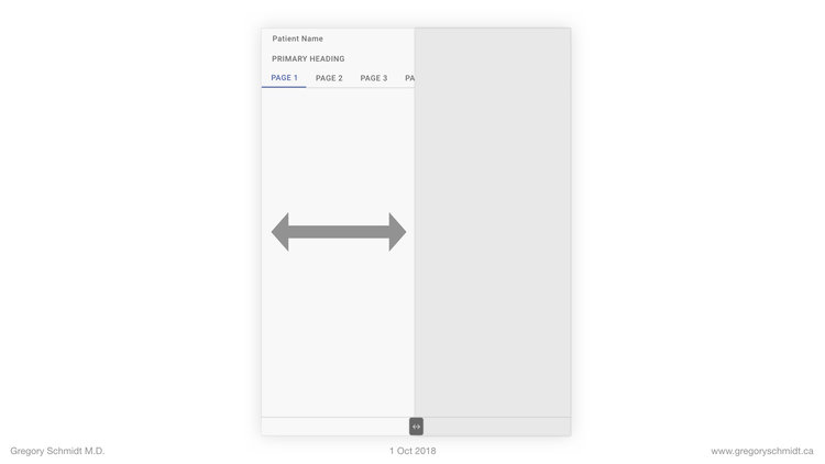
Lets place these into Header 2. The user is easily able to swipe between the major data sources. Very easy.

How can we sort the chart now by everything? Or by specific issues?

These can be placed into heading 1.

The chart is now showing everything.
But we can click the filter navigation menu row, and change it to only show the HIV program materials.


This major chart filter can be expanded beyond specific issues. One could imagine creating a list that sorts by Symptoms or Body Systems.
The primary header menu can also be changed not by clicking the filter icon, but instead by swiping left or right (in this example above on the word ‘ALL’ or ‘HIV’ to swipe through the issues without having to open the entire filter preferences window.
****** AN ASIDE ******
Data Focus. Not Silos.
When the chart is filtered to Diabetes it is important that the user is (a) alerted to the information specific to diabetes, but (b) is not ‘siloed’ or ‘walled off’ from the rest of the patient chart. A significant concern in filtering the chart is not seeing important adjacent information. For instance, the diabetes filter on medications, may prioritize A1C and Creatinine, but the user may also want to see the liver enzymes are up to suggest a metabolic syndrome.
There are two ways this can be done.
(a) A panel with the selected and priority information can be displayed at the top of the screen.
(b) The priority information can be placed in bold or highlighted. For instance, in this case you could skim a list of outpatient clinic notes - easily see when the last appointment for diabetes was, and at the same time see there were many other appointments in the interim.
Data Capsules & Auto-Configure UX
A key take home message is that this single user interface automatically configures based on the issue selected.
In this way, it makes it really easy to scale to new programs. When a program is created, the authors determine as part of its schema, what meds, labs, notes should be attached to (and prioritized) when that program is viewed.
I won’t get into more details today on this idea of program capsule, but they can also be used to control other parts of the UX - such as the number of medications someone can order for patients in a particular program.
This ability to take a standard chart and cut it into separate charts based on what you need is very helpful. Some clinics used to create ‘shadow charts’ that include the clinical information they are interested in.
Creating information summaries and selecting the relevant clinical data from a chart is also the medical student or resident before they show this information to the consultant. Sometimes this job is done in a clinic setting by a nurse or assistant before a clinic. Now all this work can be done with the medical record on the fly. Patient walks in with new arthralgia and synovitis? Simply swipe to filter the chart by ‘Rheumatology’.

Back to Building the UX
The other views are Timeline and Summary. We can first add the Timeline view in. And then the Summary view. Like the rest of the chart – these can either show the entire chart, or just the filtered issue.


Some may wonder – what about all the other important patient information such as family history, social history, address, contact information, and other personal details.
We can add a tab for this as well, and place it just off screen to the left of summary – so its easy to swipe to.

We can also add a search icon – which allows the user to search the chart. This will closely integrate into the ‘TIMELINE’ view and also provide a way to filter the timeline – such as files from a specific doctor, or location, or period of time.

To Summarize
Clinical Data can be group five major ways by source, issue, time, summary, and bloodhound.
A single user interface can be created that easily filters information based on any combination of the above
This user interface can configure automatically based on the filter grouping. This makes it easy to scale to new programs.
—> NEXT, MOVE ONTO: Part 3: Electronic Medical Record Interface Panel Ideas
CHAPTERS: EHR Mockup Presentation Oct 1, 2018
Best to read in order, or even better - watch the video:
Introduction: EHR Design Mockup - Oct 1 2018
EHR Requirements: Many types of users & devices
Part 1: Multi-Screen & Multi-Tasking EHR UI from First Principles
Part 2: A single user Interface to group clinical data 6+ ways
Part 3: Electronic Medical Record Interface Panel Ideas
Please note: these designs are simply a ‘slice in time’. The project as of Oct 1. They are in no ways a ‘final version’. There are many things I do not like about these in their current state as published.. Also, the design focus here has been on functionality. The designs have not be optimized yet for esthetic design.